| home Java Script MS Access Perl HTML Delphi C ++ Visual Basic Java CGIPerl MS Excel Front Page 98 Windows 98 Ms Word Builder PHP Assembler Link to us Links |
Developers often think that forms exist solely for the purpose of data entry. On the contrary, forms serve many different purposes in Access 95:
Probably the most common use of an Access form is as a vehicle for displaying and editing existing data or adding new data. Fortunately, Access provides numerous features that enable you to build forms that greatly ease the data-entry process for your users. Access also makes it easy for you to design forms that allow your users to view data but not modify it, view and modify data, or add new records only.
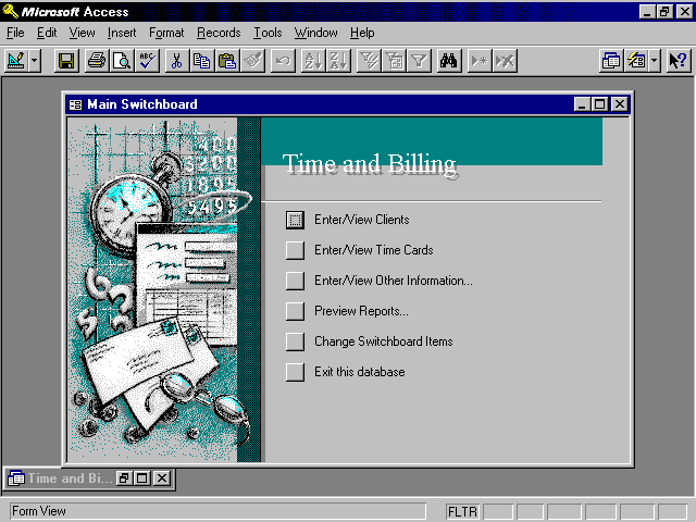
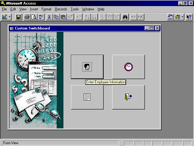
Although not everyone immediately thinks of an Access form as a means of navigation through an application, forms are quite strong in this area. Figure 6.1 shows a form created with the Switchboard Manager in Access 95. Figure 6.2 shows a "home-grown" switchboard form. Although the Switchboard Manager makes the process of designing a switchboard form extremely easy, you will find any type of switchboard easy to develop. You can be creative with switchboard forms by designing forms that are both utilitarian and exciting. Switchboard forms are covered in detail in Chapter 13, "Let's Get More Intimate with Forms: Advanced Techniques."
Figure 6.1. A form created with the Switchboard Manager.
Figure 6.2. A custom switchboard with tooltips and bitmaps.
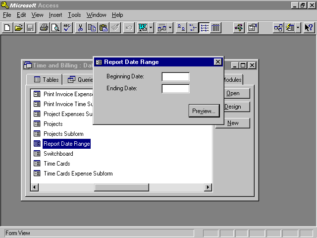
You can also use Access to create custom dialog boxes. These dialog boxes can be used to display information or retrieve information from your users. The custom dialog shown in Figure 6.3 obtains the information required to run a report. The user must fill in the required information before he or she can proceed.
Figure 6.3. A custom dialog that allows the user to specify a date range for a report.
Another strength of Access is its capability to produce professional-looking printed forms. In many other products, it is difficult to print a data-entry form. Sometimes the entire form needs to be re-created as a report. In Access, printing a form is simply a matter of clicking a button. You have the option of creating a report that displays the information that your user is entering or of printing the form itself.
Access provides many styles of forms. The data in a form can be displayed one record at a time, or you can allow the user to view several records at once. Forms can be displayed modally, meaning that the user must respond and close the form before continuing, or displayed so that the user can move through the open forms at will. The important thing to remember is that there are many uses and styles of forms. You will learn about them throughout this chapter, in Chapter 13, and throughout the book. As you read this chapter, remember that your forms are limited only by your imagination.
Access forms contain a few sections. Each of these sections has its own function and behavior. The three sections of an Access form are
The Detail section of a form is the main section. It is the section that is used to display the data of the table or query underlying the form. As you will see, the Detail section can take on many different looks. It is quite flexible and robust.
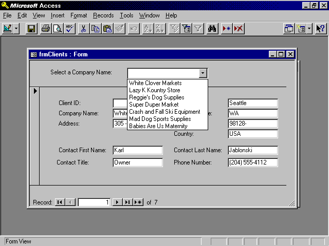
The Header and Footer sections of the form are used to display information that does not change from record to record. Command buttons that control the form are often placed in the header or footer of the form. An example would be a command button that allows the user to view all the projects associated with a particular client. Controls can also be used to help the user navigate around the records associated with the form. An example appears in Figure 6.4. The user can select from the valid list of clients. After a client has been selected from the combo box, the user is moved to the appropriate record.
Figure 6.4. Record navigation using a combo box placed in the form header.
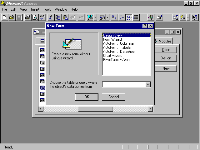
You can create a new form in several ways. The most common way is to select the Forms tab of the database window and click New. The New Form dialog appears (see Figure 6.5). This dialog allows you to select from the multitude of options available for creating a new form. Forms can be created from scratch using Design view or with the help of six wizards. The wizards are covered briefly before you move on to the process of creating a form from scratch. Even the most experienced of developers employs the use of the Form Wizard to complete certain tasks.
Figure 6.5. The New Form dialog enables you to specify the table or query that will underlie the form, as well as the method that you want to use to create the form.
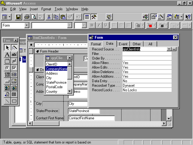
To create a form using the Form Wizard, select Form Wizard from the New Form dialog and click OK. The Form Wizard is launched. The first step of the Form Wizard prompts you for the name of the table or query that you want to use as the foundation for the form. Whether you are creating a form using a Form Wizard or from Design view, it is always better to base a form on a query. Using a query as the foundation for a form provides better performance, allows for more flexibility, and enables you to create a form based on data from multiple tables.
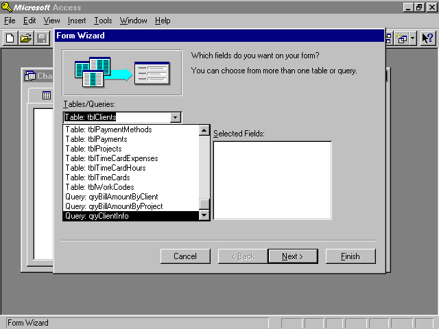
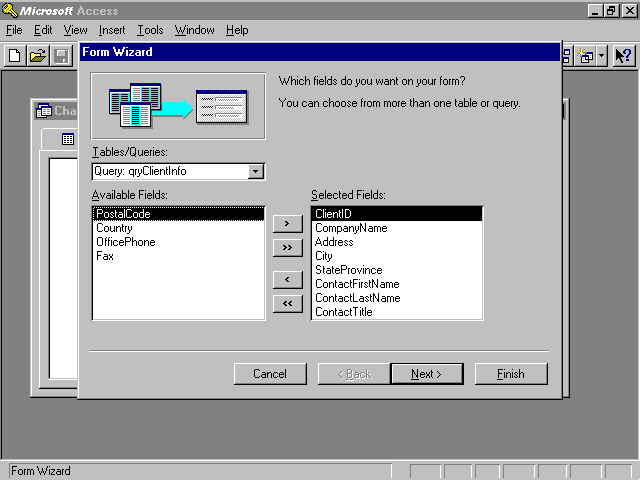
Figure 6.6 shows the Tables/Queries drop-down. You can see that all the tables are listed, followed by all the queries. After you select a particular table or query, the fields included in the query or table are displayed in the list box on the left (see Figure 6.7). To select the fields that you want to include on the form, double-click on the name of the field or click on the field and then click on the > button. In the example shown in Figure 6.7, several fields have been selected from the qryClientInfo query.
Figure 6.6. The list of available tables and queries.
Figure 6.7. The selected fields from qryClientInfo.
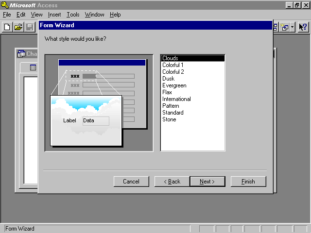
After you have selected the desired fields, click Next. The second step of the Form Wizard allows you to specify the layout for the form you are designing. You can select from Columnar, Tabular, or Datasheet. The most common choice is Columnar. Click Next after selecting a form layout. The third step of the Form Wizard allows you to select a style for your form. You can select from several predefined styles (see Figure 6.8). Don't be concerned about changing your mind at a later time; all the properties set by the wizard can be easily modified in Design view after the form has been created. Click Next after selecting a style.
Figure 6.8. Selecting a form style.
The final step of the Form Wizard allows you to provide a title for your form. Unfortunately, the title of the form becomes the name of the form as well. For this reason, type the text you want to use as the name of the form. You can worry about changing the title in Design view of the form. This step of the Form Wizard also lets you specify whether you want to view the results of your work or open the form in Design view. It is usually best to view the results and then modify the form's design after you have taken a peek at what the Form Wizard has done.
 Another way to start the Form Wizard is to click on the Tables or Queries tab and then click on the table or query on which you want the form to be based. Use the New Object drop-down on the toolbar to select New Form. The New Form dialog appears. Select Form Wizard. You don't need to use the Tables/Queries drop-down to select a table or query. The table or query that you selected prior to invoking the wizard is automatically selected for you.
Although the Form Wizards are extremely powerful and useful, in many cases it is better to build a form from scratch—especially if you are building a form that is not bound to data. To create a form without the use of a wizard, click the Forms tab and then click New. The New Form dialog appears. Select Design view (the default choice). If your form will be bound to data, use the drop-down included in the New Form dialog to select the table or query that will serve as the foundation for the form. Click OK. The Form Design window appears (see Figure 6.9).
Figure 6.9. The Form Design window enables you to build and customize a form.
The Form Design window is used to build and customize a form. Using this window, you can add objects to a form and customize them using the Properties window. Microsoft has provided numerous form and control properties. After gaining a command of these properties, you can highly customize the look and feel of your forms.
Even the best developer needs the right tools for the job. Fortunately, Microsoft has provided tools to help you build exciting and utilitarian forms. The Form Design window is made up of a toolbar, a toolbox, and the actual form you are designing. Other tools are available to assist you with the design process. They include the Field List and Properties window.
By default, two toolbars appear when you are in the Design view of a form. They are the Form Design toolbar and the Formatting toolbar. The Form Design toolbar contains buttons that allow you to save, print, copy, cut, paste, and perform other standard Windows tasks within the form. It also includes buttons that allow you to toggle the various design windows (such as the toolbox). The Formatting toolbar contains tools that allow you to graphically modify the properties of the form and the objects within it. You can modify the font, font size, and color of the selected objects on the form. You can also add bold, underline, and italic; change the alignment; and add special effects to the selected objects using the Formatting toolbar.
Many windows are available to assist you with the design process when you are in the Design view of a form. Depending on whether you have a high-resolution monitor, you will probably find it annoying to have all the windows open at once. In fact, with all the windows open at once on a low-resolution monitor, the form is probably buried underneath all the windows. This is why Microsoft has made each window open and close in a toggle-like fashion. The Form Design toolbar contains tools for the Field List, Toolbox, and Properties windows. Each of these toolbar buttons is a toggle. Clicking once on the button opens the appropriate window. Clicking a second time closes the window.
Figure 6.10 shows a form with the Field List, Toolbox, and Properties windows open. Although each of these windows can be sized as desired, the design environment in this low-resolution display is rather cluttered with all these windows open. One of the tricks in working with Access is knowing when it is appropriate to have each set of tools available. The goal is to have the right windows open at the right time as often as possible.
Figure 6.10. The Form Design toolbar with Design windows visible.
 The Field List, Toolbox, and Properties windows can be closed using the toolbar buttons. In addition, they can be closed using the Close button on each window. They can also be toggled using the View menu.
Fields can be easily added to a form using the Field List window. The Field List window contains all the fields that are part of the record source for the form. For example, in Figure 6.10 the record source of the form is qryClientInfo. The fields listed in the Field List window are the fields that are part of the query. The record source for the form is the table or query that underlies the form. To add fields to a form, follow these steps:
To add multiple fields to a form at the same time, select several fields from the field list. Use the Ctrl key to select multiple noncontiguous fields or the Shift key to select multiple contiguous fields. For example, hold down your Ctrl key and click on three noncontiguous fields. Each field is selected. Now click a field, hold down your Shift key, and click another field. All fields between the two fields are selected. Click and drag any of the selected fields to the form. All selected fields are added to the form at once.
You need to know several important tricks of the trade when selecting, moving, aligning, and sizing form objects. These tips will save you hours of frustration and wasted time.
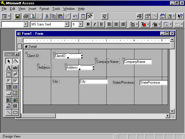
The easiest way to select a single object on a form is to click on it. When the object is selected, you can move it, size it, or change any of its properties. Selecting multiple objects is a bit trickier and can be done in several ways. Different methods are more efficient in different situations. To select multiple objects, you can hold down the Shift key and click on each object that you want to select. Each selected object is surrounded by selection handles, indicating that it is selected.
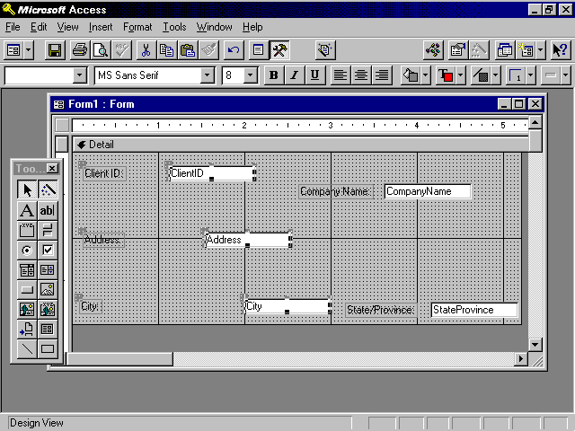
Figure 6.11 shows a form with four selected objects. It is important that you understand which objects are actually selected. The ClientID text box, the Address label and text box, and the Company Name label are all selected. The Client ID label and CompanyName text box are not selected. If you look closely at the figure, you see that the selected objects are completely surrounded by selection handles. The Client ID label and CompanyName text box have single selection handles because they are attached to objects that are selected. If you change any properties of the selected objects, the Client ID label and CompanyName text box are unaffected.
Figure 6.11. Selecting objects on a form.
You can also select objects by lassoing them. To lasso objects, the objects must be located close to one another on the form. Place your mouse pointer on a blank area of the form (not over any objects), and then click and drag. You notice that a thin line appears around the objects that your mouse pointer is encircling. When you let go, any objects that were anywhere within the lasso, including those that were only partially surrounded, are selected. If you want to deselect any of the selected objects to exclude them from the selection, hold down your Shift key and click on the object you want to deselect.
One of my favorite ways to select multiple objects is to use the horizontal and vertical rulers that appear at the edges of the Form Design window. Click and drag within the ruler. Notice that as you click and drag on the vertical ruler, two horizontal lines appear, indicating which objects will be selected. As you click and drag across the horizontal ruler, two vertical lines appear, indicating the selection area. When you let go of your mouse, any objects that are anywhere within the lines are selected. As with the process of lassoing, to remove any objects from the selection, hold down your Shift key and click on the object you want to deselect.
To move a control along with its attached label, you do not need to select it first. Place your mouse over the object and click and drag. An outline appears, indicating the new location of the object. When the object reaches the desired position, release the mouse. An attached label automatically moves with its corresponding control.
To move more than one object at a time, you must first select the objects that you want to move. Select the objects using any of the methods outlined in the previous section. Place your mouse over any of the selected objects and click and drag. An outline appears, indicating the proposed new position for the objects. Release the mouse when you have reached the desired position.
Sometimes, you want to move a control independent of its attached label, which requires a special technique. If you click on a control, such as a text box, you see that as you move your mouse over the border of the control, a hand appears with five fingers pointing upward. If you click and drag, both the control and the attached label move as a unit. The relationship between them is maintained. If you place your mouse pointer over the larger handle in the upper-left corner of the object, the mouse pointer appears as a hand with only the index finger pointing upward. If you click and drag here, the control moves independently of its attached label. The relationship between the objects changes.
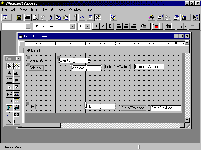
Access makes it easy to align objects. Figure 6.12 shows several objects that are not aligned. Notice that the attached labels of three of the objects are selected. If you align the attached labels, the controls (in this case text boxes) remain in their original positions. If you select the text boxes as well, they attempt to align with the attached labels. Because Access does not allow the objects to overlap, the text boxes end up immediately next to their attached labels. To left-align any objects (even objects of different types), select the objects that you want to align and then select Format|Align|Left. The selected objects become aligned (see Figure 6.13). You can align the left, right, top, or bottom edges of any objects on a form. You can also align the center of each object.
Figure 6.12. The form before aligning objects.
Figure 6.13. The form after aligning objects.
Do not confuse the Format|Align feature with the Align tools on the Formatting toolbar. The Format|Align feature aligns objects one to the other, whereas the Align tools on the Formatting toolbar align the text of an object within its borders.
The Snap to Grid feature determines whether the objects snap to the gridlines on the form as you move and size them. This feature is found under the Format menu. If you turn this feature off (it is a toggle), objects can be moved and sized without regard for the gridlines.
I prefer to leave the Snap to Grid feature on at all times. I use a special trick to temporarily deactivate the feature when needed. To temporarily deactivate Snap to Grid, hold down your Ctrl key as you click and drag to move objects. The Snap to Grid setting is ignored.
Just as there are several ways to move objects, there are several ways to size objects. When an object is selected, each handle (except for the handle in the upper-left corner of the object) can be used to size the object. The handles at the top and bottom of the object allow you to change the height of the object. The handles at the left and right of the object allow you to change the width of the object. The handles in the upper-right, lower-right, and lower-left corners of the object allow you to change the width and height of the object simultaneously. To size an object, place your mouse pointer over a sizing handle and click and drag. You can select multiple objects and size them at the same time. Each of the selected objects increases or decreases in size by the same amount. The relative sizes of the objects remain intact.
Access provides several powerful methods of sizing multiple objects, found under the Format|Size menu:
Probably the most confusing of the options is Format|Size|To Fit. This option is somewhat deceiving because it does not perfectly size text boxes to the text within them. In today's world of proportional fonts, it is not possible to perfectly size a text box to the largest possible entry that it contains. You can generally visually size text boxes to a sensible height and width. Use the Size property of the field to limit what is typed in the text box. If the entry is too large to fit in the allocated space, the user can scroll to view the additional text.
Access provides excellent tools to help you space the objects on your form an equal distance from one another. Notice in Figure 6.14 that the ClientID, Address, and City text boxes are not equally spaced from one another. To make the vertical distance between selected objects equal, select Format|Vertical Spacing|Make Equal. The result of performing this command on the objects selected in Figure 6.14 appears in Figure 6.15.
Figure 6.14. The form before modifying vertical spacing.
Figure 6.15. The form after modifying vertical spacing.
The horizontal distance between objects can be made equal using Format|Horizontal Spacing|Make Equal. Other useful related commands are Format|Vertical Spacing|Increase (or Decrease) and Format|Horizontal Spacing|Increase (or Decrease). These commands maintain the relationship between objects while proportionally increasing or decreasing the distance between them.
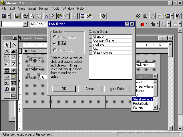
The tab order for the objects on a form is determined by the order in which you add the objects to the form. This order is not necessarily appropriate for the user. It might become necessary to modify the tab order of the objects on the form. To do so, select View|Tab Order. The Tab Order dialog appears (see Figure 6.16). This dialog offers two options. Use the Auto Order command button to tell Access to set the tab order based on the location of each object in a section on the form. If you want to customize the order of the objects, click and drag the gray buttons to the left of the object names listed under the Custom Order heading to specify the tab order of the objects.
You must set the tab order for the objects in each section of the form separately. To do this, select the appropriate section from the tab order dialog (see Figure 6.16), and then set the order of the objects in the section. In Figure 6.16, the Form Header and Form Footer are unavailable because the selected form does not have a header or footer.
Figure 6.16. The Tab Order dialog enables you to select the tab order of the objects in each section of a form.
Windows programming in general, and Access programming in particular, is not limited to just writing code. Your ability to design a user-friendly interface can make or break the success of your application. Access and the Windows programming environment offer a variety of controls. Each control is appropriate in different situations. The next section discusses each control, outlining when and how it should be used.
Labels are used to display information to your users. Attached labels are automatically added to your form as you add other controls such as text boxes, combo boxes, and so on. Attached labels can be deleted or modified as necessary. Their default captions are based on the Caption property of the field that underlies the control to which they are attached. If nothing has been entered into the Caption property of the field, the field name is used for the caption of the label.
The Label tool, found in the toolbox, can be used to add any text to the form. Click the Label tool, and then click and drag the label to place it on the form. Labels are often used to provide a description of the form or to supply instructions to users. Labels can be customized by modifying their font, size, color, and so on. They cannot be modified by the user at runtime, but they can be modified at runtime using VBA code.
Text boxes are used to obtain information from the user. Bound text boxes display and retrieve field information, whereas unbound text boxes gather information from the user that is not related to a specific field in a specific record. For example, a text box can be used to gather information from a user regarding report criteria.
Text boxes are automatically added to a form when you click and drag a field from the field list to the form and the Display control for the field is set to Text Box. Another way to add a text box to a form is to select the Text Box tool from the toolbox. Click to select the Text Box tool and then click and drag to place the text box on the form. This process adds an unbound text box to the form. If you want to bind the text box to data, you must set its Control Source property.
Access offers several easy ways to add a combo box to a form. If the Display Control property of a field has been set to Combo Box, a combo box is automatically added to a form when the field is added to the form. The combo box automatically knows the source of its data as well as all its other important properties.
If the Display Control property of a field has not been set to Combo Box, the easiest way to add a combo box to a form is to use the Control Wizard. The Control Wizard, when selected, helps you to add combo boxes, list boxes, option groups, and subforms to your forms. Although all the properties set by the Combo Box Wizard can be set manually, using the wizard saves both time and energy. If you want the Combo Box Wizard to be launched when you add a combo box to the form, make sure the Control Wizards tool in the toolbox has been pressed (switched on) before you add the combo box.
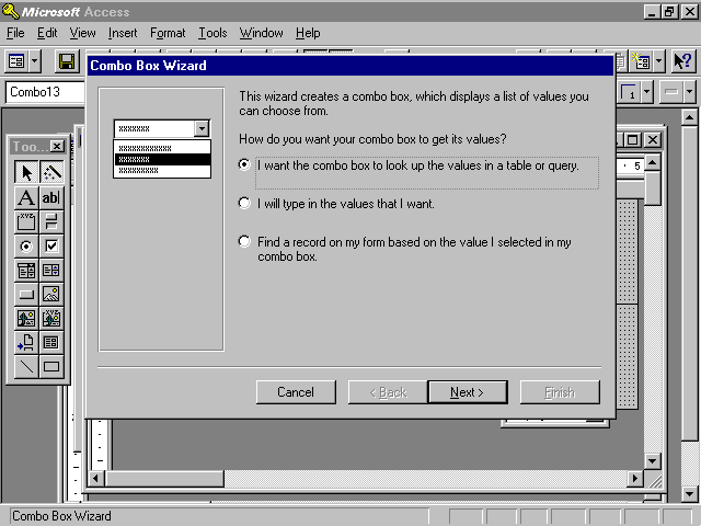
To add a combo box to a form, select the Combo Box tool in the toolbox. Click and drag to place the combo box on the form. The Combo Box Wizard is launched. The first step of the Combo Box Wizard appears in Figure 6.17. You are asked whether you want the combo box to look up the values in a table or query, whether you prefer to type the values yourself, or whether the combo box will be used to search for a particular record. The first option should be used if your combo box is going to be used to select the data that is stored in a field. An example would be the state associated with a particular client. I rarely, if ever, use the second option, which requires that you type the values for the combo box. Populating a combo box this way makes it difficult to maintain. Every time you want to add an entry to the combo box, your application must be modified. The third and final option is appropriate when you want the combo box to be used as a tool to locate a specific record. An example is a combo box, placed in the header of a form, that displays a list of valid customers. After selecting a customer, the user is moved to the appropriate record. This option is available only when the form is bound to a recordsource.
Figure 6.17. The first step of the Combo Box Wizard.
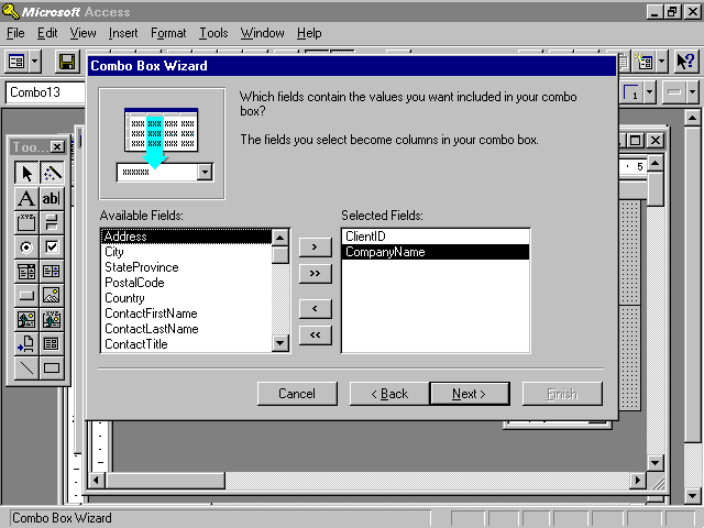
The second step of the Combo Box Wizard allows you to select a table or query to populate the combo box. For optimal performance, you should select a query. The third step of the Combo Box Wizard allows you to select the fields that appear in your combo box (see Figure 6.18). The combo box being built in the example is used to select the client associated with a particular project. Although the CompanyName field is the only field visible within the combo box, ClientID and CompanyName have both been selected. The ClientID field is a necessary element of the combo box. When a CompanyName has been selected from the combo box, the ClientID associated with the CompanyName is stored in the ClientID field of the tblProjects table.
Figure 6.18. The third step of the Combo Box Wizard: selecting fields.
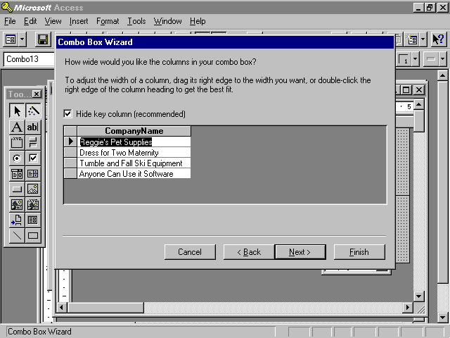
The fourth step of the Combo Box Wizard allows you to specify the width of each field in the combo box. Notice in Figure 6.19 that Access recommends that the key column, ClientID, be hidden. The idea is that the user will see the meaningful English description while Access worries about storing the appropriate key value into the record.
Figure 6.19. The fourth step of the Combo Box Wizard: setting column widths.
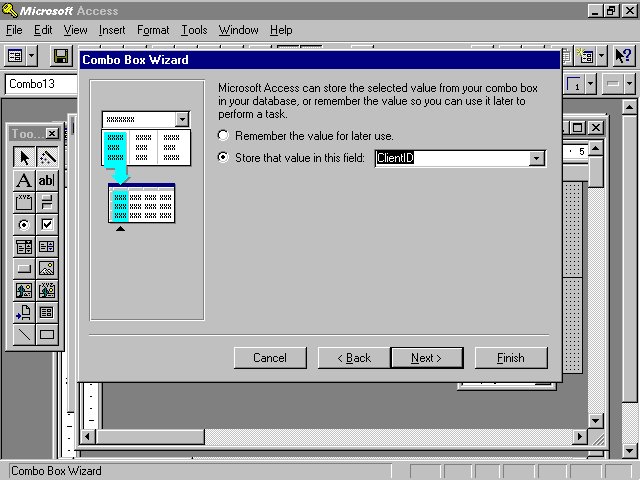
The fifth step of the Combo Box Wizard allows you to specify whether you want Access to simply remember the selected value or to store it into a particular field in a table. In the example shown in Figure 6.20, the selected combo box value is stored in the ClientID field of the tblProjects table.
Figure 6.20. The fifth step of the Combo Box Wizard, indicating where the selected value should be stored.
The sixth and final step of the Combo Box Wizard prompts for the text that becomes the attached label for the combo box. The Finish button completes the process, building the combo box and filling in all its properties with the appropriate values.
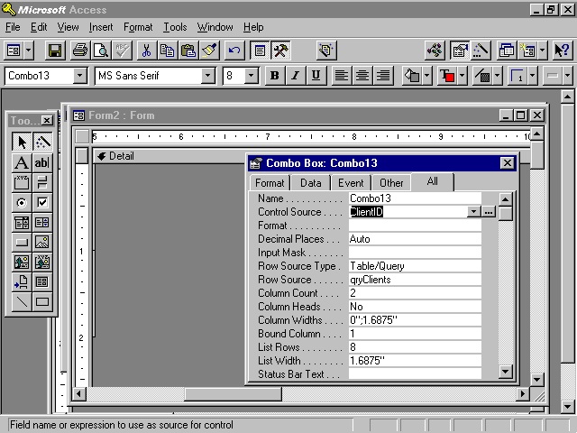
Although the Combo Box Wizard is a wonderful tool, it is important to understand the properties that it sets. Figure 6.21 shows the Properties window for a combo box. Many of the Combo Box properties are covered in other chapters, but let's go over the properties set by the Combo Box Wizard here.
The Control Source property indicates the field in which the selected entry is stored. In Figure 6.21, the selected entry is stored in the ClientID field of the tblProjects table. The Row Source Type property specifies whether the source used to populate the combo box is a table/query, value list, or field list. In the example, the Row Source Type is Table/Query. The Row Source is the name of the actual table or query used to populate the combo box. In the example, the Row Source is qryClients. The Column Count property designates how many columns are in the combo box. The Column Widths property indicates the width of each column. In the example, the width of the first column is zero, which renders the column invisible. Finally, Bound Column is used to specify which column in the combo box is being used to store data into the Control Source. In the example, this is column one.
Figure 6.21. The properties of a combo box showing that the ClientID field has been selected as the Control Source for the Combo13 combo box.
Combo boxes are extremely powerful controls. You need to know many other things about them to leverage their power. The advanced aspects of combo boxes are covered in Chapter 13.
List boxes are very similar to combo boxes but differ from them in three major ways:
As with a combo box, the Display control of a field can be set to List Box. If the Display control has been set to List Box, a list box is added to the form when the field is clicked and dragged from the field list to the form.
The List Box Wizard is almost identical to the Combo Box Wizard. After running the List Box Wizard, the List Box properties affected by the wizard are the same as the Combo Box properties. Advanced list box techniques are covered in Chapter 13.
Check boxes are used when you want to limit your user to entering one of two values. The values entered can be limited to Yes/No, True/False, or On/Off. You can add a check box to a form in several ways:
Option buttons can be used alone or as part of an option group. An option button alone can be used to display a True/False value, but this is not a standard use of an option button (check boxes are standard for this purpose). As part of an option group, option buttons force the user to select from a mutually exclusive set of options. An example is payment type: American Express, MasterCard, Visa, or Discover. This use of option buttons is covered in the section on option groups.
Like option buttons, toggle buttons can be used alone or as part of an option group. A toggle button by itself can display a True/False value, but this is not a standard use of a toggle button. Toggle buttons are more commonly used as part of an option group, as discussed in the next section.
Option groups allow the user to select from a mutually exclusive set of options. They can comprise check boxes, toggle buttons, or option buttons. The most common implementation of an option group is option buttons.
The easiest way to add an option group to a form is to use the Option Group Wizard. To ensure that the Option Group Wizard will run, make sure the Control Wizards button in the toolbox is selected. Click Option Group in the toolbox and then click and drag to add the option group to the form. The Option Group Wizard is launched.
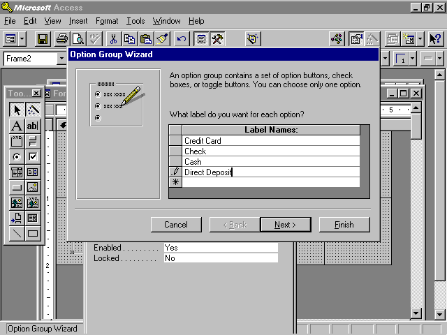
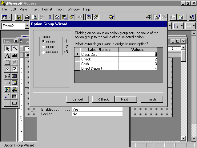
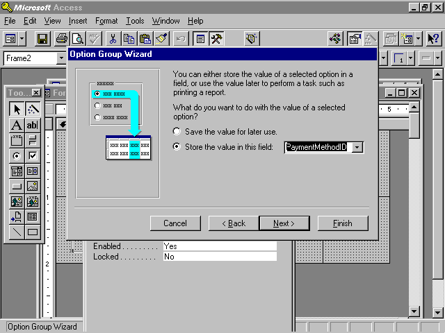
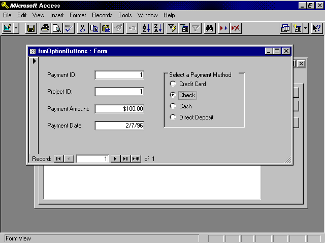
The first step of the Option Group Wizard, shown in Figure 6.22, allows you to type the text that will be associated with each item in the option group. The second step of the Option Group Wizard gives you the option of selecting a default choice for the option group. This choice comes into effect when a new record is added to the table underlying the form. The third step of the wizard allows you to select values associated with each option button (see Figure 6.23). The text displayed with the option button is not stored in the record. Instead, the underlying numeric value is stored in the record. In the example in Figure 6.23, the number 2 is stored in the field if Check is selected. The fourth step of the Option Group Wizard asks whether you want to remember the option group value for later use or whether you want to store the value in a field. In the example in Figure 6.24, the option group value is stored in the PaymentMethodID field. The fifth step of the Option Group Wizard allows you to select from a variety of styles for the option group buttons. You can select among option buttons, check boxes, and toggle buttons. You can also select from etched, flat, raised, shadowed, or sunken effects for your buttons. The wizard lets you preview each option. The sixth and final step of the wizard allows you to add an appropriate caption to the option group. The completed group of option buttons appears in Figure 6.25.
Figure 6.22. Step 1 of the Option Group Wizard: adding text to options.
Figure 6.23. Step 3 of the Option Group Wizard: selecting values for options.
Figure 6.24. Step 4 of the Option Group Wizard: tying the group to data.
Figure 6.25. The results of running the Option Group Wizard.
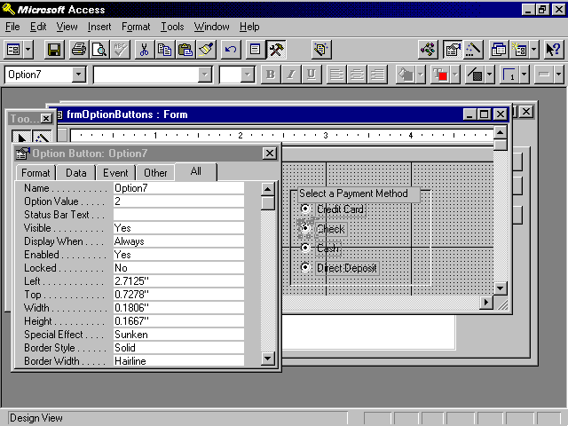
It is important to understand that the Option Group Wizard sets properties of the frame, the option buttons within the frame, and the labels attached to the option buttons. The properties of the frame are shown in Figure 6.26. The control source of the frame and default value of the option group are set by the Option Group Wizard. Each individual option button is assigned a value, and the caption of the attached labels associated with each button is set.
Figure 6.26. The properties of an option group frame showing the properties of the selected button.
When you first build a form, you might not always make the best choice for the type of control to display each field on the form, or you might make what you think is the best choice for the control, only to find out later that it was not exactly what your user had in mind. In earlier versions of Access, this meant a lot of work. In Access 95, it is easy to morph, or convert, the type of control. For example, you can morph a list box into a combo box.
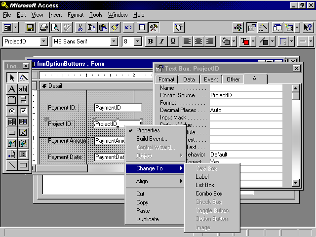
One of the most common types of conversions is from a text box to a combo box. To morph a text box to a combo box, click with your right mouse button on the text box. Select Change To and then select the type of control you want to morph the text box to. The types of controls available depend on the type of control you are morphing. For example, a text box can be converted to a label, list box, or combo box (see Figure 6.27).
Figure 6.27. Morphing a text box.
After morphing a text box to a combo box, you need to modify the appropriate Control properties. The Row Source, Bound Column, Column Count, and Column Widths properties need to be filled in. You need to select the appropriate table or query for the row source. If you select a table and then click on the ellipsis, you are prompted to create a query based on the table. After selecting Yes, you can build a query containing only the fields that you want to include in the combo box. You are then ready to select the bound column. The bound column is used to store data into the underlying table. For example, the user might select the name of a project that a payment is being applied to, but the ProjectID will be stored in the Payments table. You need to set the column count to the number of columns selected in the underlying query. The column widths can be set so that the key column is hidden.
Converting a combo box to a list box is a much simpler process than converting a text box to a combo box or list box because combo boxes and list boxes share so many properties. To morph a combo box to a list box, simply click with the right mouse button on the combo box and select Change To|List Box.
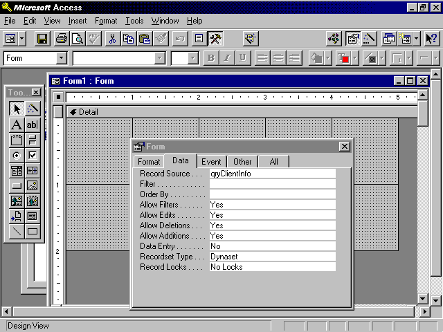
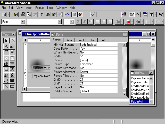
Forms have many properties. These properties can be used to affect the look and behavior of the form. The properties are broken down into categories: Format, Data, Event, and Other. To view a form's properties, you must select the form in one of two ways:
After a form has been selected, click the Properties button on the toolbar to view its properties. The Properties window is shown in Figure 6.28. Notice that it consists of five tabs: Format, Data, Event, Other, and All. Many developers prefer to view all properties at once, but a form has a total of 75 properties! Rather than viewing all 75 properties at once, try viewing the properties by category. The Format category includes all the physical attributes of the form. These are the attributes that affect the form's appearance. An example is the form's background color. The Data category includes all the properties that relate to the data to which the form is bound. An example is the form's underlying record source. The Event category contains all the Windows events to which a form can respond. For example, you can write code that executes in response to the form being loaded, becoming active, displaying a different record, and so on. The Other category contains a small number of properties that do not fit into any of the other three categories.
Figure 6.28. Viewing the Format properties of a form.
As mentioned, forms have 75 properties. Thirty-one of those properties are Event properties, which are covered in Chapter 13. This section covers Format, Data, and Other properties of forms.
The Format properties of a form affect its physical appearance. Forms have 24 Format properties:
Caption: The Caption property sets the text that appears on the title bar of the form. This property can be customized at runtime. An example would be to include the name of the current user or specify the name of the client for whom an invoice is being generated.
Default View: The Default View property allows you to select three options:
The selected option becomes the default view for the form.
Views Allowed: The Views Allowed property determines whether the user is allowed to switch from Form view to Datasheet view or vice versa. The Default View property determines the default display mode for the form, and Views Allowed determines whether the user is permitted to switch out of the default view.
Scroll Bars: The Scroll Bars property determines whether scrollbars appear if the controls on the form do not fit within the form's display area. You can select from vertical and horizontal, neither vertical nor horizontal, just vertical, or just horizontal.
Record Selectors: A record selector is the gray bar that appears to the left of a record when the user is in Form view or the gray box that appears to the left of each record when the user is in Datasheet view. A record selector allows the user to select a record to be copied or deleted. The Record Selectors property determines whether the record selectors appear. If you provide the user with a custom menu, you can opt to remove the record selector to ensure that the user copies or deletes records using only functionality specifically built into your application.
Navigation Buttons: Navigation buttons are the controls that appear at the bottom of a form, allowing the user to move from record to record within the form. The Navigation Buttons property determines whether the navigation buttons are visible. You should set the Navigation Button property to No for any dialog forms. You might want to set the Navigation Button property to No for data-entry forms, and add your own toolbar or command buttons that enhance or limit the functionality of the standard buttons. For example, in a client/server environment, you might not want to give users the ability to move to the first or last record. This type of record movement can be very inefficient in a client/server architecture.
Dividing Lines: The Dividing Lines property is used to indicate whether you want a line to appear between each record when the default view of the form is set to Continuous Forms.
Auto Resize: The Auto Resize property determines whether the form is automatically sized to display a complete record.
Auto Center: The Auto Center property is used to specify whether you want the form to be automatically centered within the Application window whenever it is opened.
Border Style: The Border Style property is far more powerful than its name implies. The options for the Border Style property are None, Thin, Sizable, and Dialog. The border style is often set to None for splash screens, which means that the form has no border. A Thin border is not resizable; the Size command is not available within the Control menu. This setting is a good choice for pop-up forms, which remain on top even when other forms are given the focus. A Sizable border is standard for most forms. It includes all the standard options within the Control menu. A Dialog border is thick. A form with a border style of Dialog cannot be maximized, minimized, or resized. When the border style of a form is set to Dialog, the Maximize, Minimize, and Resize options are not available within the Control menu of the form. The Dialog border is often used along with the Pop Up and Modal properties to create custom dialog boxes.
Control Box: The Control Box property is used to determine whether a form has a Control menu. You should use this option sparingly. One of your responsibilities as an Access programmer is to make your applications comply with Windows standards. If you look at the Windows programs you use, you find very few forms without Control Menu boxes. This should tell you something about how you should design your own applications.
Min Max Buttons: The Min Max Buttons property is used to indicate whether the form has minimize and maximize buttons. The available options are None, Min Enabled, Max Enabled, and Both Enabled. If you remove one or both buttons, the appropriate options also become unavailable in the Control menu. The Min Max property is ignored for forms with a border style of None or Dialog. As with the Control Box property, I rarely use this property. In an attempt to make my applications Windows-standardized, I set the Border Style property and then inherit the standard attributes for each border style.
Close Button: The Close Button property determines whether the user is able to close the form using the Control menu or by double-clicking on the Control icon. If you set the value of this property to No, you must provide your user with another way to close the form; otherwise, the user might have to reboot his or her computer to close your application.
Whats This Button: The Whats This Button property is used to specify whether you want the Whats This button added to the form's title bar. This feature works only when the form's Min Max Buttons property is set to No. When set to Yes, the user can click on the Whats This button and then click on an object on the form. Help for the selected object is displayed. If the selected object has no help associated with it, help for the form is displayed. If the form has no help associated with it, Microsoft Access Help is displayed.
Width: The Width property is used to specify the width of the form. This option is most often set graphically by clicking and dragging to select an appropriate size for the form. You might want to set this property manually when you want more than one form to be exactly the same size.
Picture, Picture Type, Picture Size Mode, Picture Alignment, and Picture Tiling: The Picture properties allow you to select and customize the attributes of a bitmap to be used as the background for a form.
Grid X, Grid Y: The Grid X and Grid Y properties can be used to modify the spacing of the horizontal and vertical lines that appear in the form when in Design view. By setting these properties, you can affect the precision of the placement of objects on the form when the Snap to Grid option is active.
Layout for Print: The Layout for Print property is used to specify whether screen or printer fonts are used on the form. If you want to optimize the form for printing rather than display, set this property to Yes.
Palette Source: The Palette Source property is used to determine the source for the selectable colors for a form.
The Data properties of a form are used to control the source for the form's data, what sort of actions the user can take on the data within the form, and how the data within the form is locked in a multiuser environment. There are 10 Data properties of a form:
Record Source: The Record Source property is used to indicate the Table, Stored Query, or SQL statement on which the form's records are based. After you have selected a record source for a form, the controls on the form can be bound to the fields within the record source.
The Field List window is unavailable until the record source of the form has been set.
The record source of a form can be changed at runtime. This aspect of the Record Source property allows you to create generic, reusable forms that can be used in many situations.
Filter: The Filter Property is used to automatically load a stored filter along with the form. I prefer to base a form on a query that limits the data displayed on the form. The query can be passed parameters at runtime to customize exactly what data is displayed.
Order By: The Order By property is used to specify in what order the records on a form appear. This property can be modified at runtime to change the order in which the records appear.
Allow Filters: The Allow Filters property allows you to control whether records can be filtered at runtime. When this option is set to No, all filtering options become disabled to the user.
Allow Edits, Allow Deletions, Allow Additions: These properties let you specify whether the user can edit data, delete records, or add records from within the form. These options cannot override any permissions that have been set for the form's underlying table or queries. Security is covered in Chapters 30 and 31.
Data Entry: The Data Entry property is used to determine whether your users can only add records within a form. Set this property to Yes if you do not want your users to be able to view or modify existing records but be able to add new records.
Recordset Type: The Recordset Type property gives you three options: Dynaset, Dynaset (Inconsistent Updates), and Snapshot. Each of these options offers different performance and updatability. The Dynaset option creates a fully updatable recordset. The only exceptions to this rule involve records or fields that are not updatable for some other reason. An example is a form based on a query involving a One-to-Many relationship. The join field on the one side of the relationship is updatable only if the Cascade Update Related Records feature has been enabled. The Dynaset option allows all tables and bound data to be edited. The Snapshot option allows no updatability.
Record Locks: The Record Locks property is used to specify the locking mechanism that will be used for the data underlying the form's recordset. Three options are available. The No Locks option provides optimistic locking. Access does not attempt to lock the record until the user moves off the record. This option can lead to potential conflicts when two users simultaneously make changes to the same record. No Locks is the least restrictive locking mechanism. The All Records option is used to lock all records underlying the form for the entire time the form is open. This is the most restrictive option and should be used only when it is necessary for the user of the form to ensure that other users can view, but not modify, the form's underlying recordset. The Edited Record option locks a 2K page of records as soon as a user starts editing the data within the form. This option provides pessimistic locking. Although it averts conflicts by prohibiting two users from modifying a record at the same time, this option can lead to potential locking conflicts. These three locking options are covered in detail in Chapter 18, "Developing for a Multiuser Environment."
Pop Up: The Pop Up property is used to indicate whether the form always remains on the top of other windows. This property is often set to Yes, in conjunction with the Modal property, for custom dialog boxes.
Modal: The Modal property is used to indicate whether focus can be removed from a form while it is open. When the Modal property is set to Yes, the form must be closed before the user can continue working with the application. As mentioned, this property is used in conjunction with the Pop Up property to create custom dialog boxes.
Cycle: The Cycle property is used to control the behavior of the Tab key within the form. The options for the Cycle property are All Records, Current Record, and Current Page. When the Cycle property is set to All Records, users are placed on the next record when they press Tab from the last control on the form. When the Cycle property is set to Current Record, users are moved from the last control on a form to the first control on the same record. The Current Page option refers only to multipage forms. With a multipage form, when the Cycle property is set to Current Page, users tab from the last control on the page to the first control on the same page. All three options are affected by the tab order of the objects on the form.
Menu Bar: The Menu Bar property is used to specify a menu bar associated with the form. The menu bar is created using the Menu Builder. Menus are covered in Chapter 13.
Shortcut Menu, Shortcut Menu Bar: The Shortcut Menu property is used to indicate whether a Shortcut menu is displayed when the user clicks with the right mouse button over an object on the form. The Shortcut Menu Bar property allows you to associate a custom menu with a control on the form or with the form itself.
Fast Laser Printing: The Fast Laser Printing property is used to determine whether lines and rectangles print along with the form. When this property is set to Yes, the performance when printing the form to a laser printer is dramatically improved.
Help File, Help Context ID: The Help File and Help Context ID properties are used to associate a specific help file and topic with a form.
Tag: The Tag property is an extra property that can be used to store miscellaneous information about the form. This property is often set and monitored at runtime to store necessary information about the form.
Available Control properties vary immensely depending on the type of control that has been selected. The more-common properties are covered in this section. More-individualized properties are covered throughout the book as they apply to a specific topic.
Format: The Format property of a control is used to determine the way the data within the control is displayed. The format for a control is automatically inherited from its underlying data source. This property is used in only two situations:
You can select from a multitude of predefined values for the format of a control, or you can create a custom format. I often modify this property at runtime to vary the format of a control depending on a certain condition. For example, the format for a VISA card number is different from the format for an ATM card number.
Visible: The Visible property is used to indicate whether a control is visible. This property can be toggled at runtime depending on specific circumstances. An example is a question on the form that applies only to records where the gender is set to Female. If the gender is set to Male, the question should not be visible.
Display When: The Display When property is used when you want certain controls on the form to be sent only to the screen or only to the printer. The three options are Always, Print Only, or Screen Only. An example of the use of the Display When property is a label containing instructions. You might want the instructions to appear on the screen but not on the printout.
Scroll Bars: The Scroll Bars property is used to determine whether scrollbars appear when the data within the control does not fit within the size of the control. The options are None and Vertical. I often set the Scroll Bars property to Vertical when the control is used to display data from a Memo field. The scrollbar makes it easier for the user to work with a potentially large volume of data contained within the Memo field.
Can Grow, Can Shrink: The Can Grow and Can Shrink properties apply only to the printed version of the form. The Can Grow property, when set to Yes, expands the control when printing so that all the data within the control fits on the printout. The Can Shrink property applies when no data has been entered into the control. When this property is set to Yes, the control shrinks when no data has been entered so that blank lines won't be printed.
Left, Top, Width, Height: These properties are used to set the position and size of the control.
Back Style, Back Color: The Back Style property can be set to Normal or Transparent. When set to Transparent, the background color of the form shows through the control. This is often the preferred setting for an option group. The Back Color property of the control is used to specify the background color (as opposed to text color) for the control.
 If the back style of a control is set to Transparent, the back color of the control is ignored.
Special Effect: The Special Effect property is used to add 3-D effects to a control. The options for this property are Flat, Raised, Sunken, Etched, Shadowed, and Chiseled. Each of these effects provides a different look and feel for the control.
Border Style, Border Color, Border Width: These properties affect the look, color, and thickness of the border of a control. The border style options are Transparent, Solid, Dashes, Short Dashes, Dots, Sparse Dots, Dash Dot, and Dash Dot Dot. The Border Color property is used to specify the color of the border. You can select from a variety of colors. The Border Width property can be set to one of several point sizes.
If the border style of a control is set to Transparent, the border color and border width of the control are ignored.
Fore Color, Font Name, Font Size, Font Weight, Font Italic, Font Underline: These properties control the appearance of the text within a control. As their names imply, they allow you to select a color, font, size, and thickness for the text, as well as to determine whether the text is italicized or underlined. These properties can be modified in response to an event that occurs at runtime. An example would be to modify the text color of a control if the value within that control exceeds a certain amount.
Text Align: The Text Align property is often confused with the ability to align controls. The Text Align property affects how the data is aligned within a control.
Control Source: The Control Source property is used to specify the field from the record source that is associated with that particular control. A control source can also be any valid Access expression.
Decimal Places: The Decimal Places property is used to specify how many decimal places you want to appear within the control. This property is used in conjunction with the Format property to determine the appearance of the control.
Input Mask: The Format and Decimal Places properties affect the appearance of the control, but the Input Mask property affects what data can be entered into the control. The input mask of the field underlying the control is automatically inherited into the control. If no input mask is entered as a field property, the input mask can be entered directly in the form.
If a Format property and an Input Mask property of a control are different, the Format property affects the display of the data within the control until the control receives focus. When the control receives focus, the Input Mask property prevails.
Default Value: The Default Value property of a control determines the value that is assigned to new records entered within the form. This property can be set within the field properties. A default value set at the field level is automatically inherited into the form. The default value set for the control overrides the default value set at the field level.
Validation Rule, Validation Text: The validation rule and validation text of a control perform the same function as the validation rule and validation text for a field.
Because the validation rule is enforced at the database engine level, the validation rule set for a control cannot be in conflict with the validation rule set for the field to which the control is bound. If the two rules conflict, the user is unable to enter data into the control.
Enabled: The Enabled property determines whether you allow a control to receive focus. If set to No, the control appears dimmed.
Locked: The Locked property determines whether the data within the control can be modified. When the Locked property is set to Yes, the control can receive focus but cannot be edited. The Enabled and Locked properties of a control interact with one another. Table 6.1 summarizes their interactions.
Enabled |
Locked |
Effect |
|
Yes |
Yes |
The control can receive focus. Its data can be copied but not modified. |
|
Yes |
No |
The control can receive focus. Its data can be edited. |
|
No |
Yes |
The control cannot receive focus. |
|
No |
No |
The control cannot receive focus. Its data appears dimmed. |
Name: The Name property enables you to name the control. This name is used when you refer to the control in code. It is also displayed in various drop-downs that show all the controls on a form. It is very important to name your controls. Named controls improve the readability of your code and facilitate the process of working with Access forms and other objects. The naming conventions for controls appear in Appendix B.
Status Bar Text: The Status Bar Text property is used to specify the text that appears in the status bar when the control receives focus. This property setting overrides the Description property that can be set in the design of a table.
Enter Key Behavior: The Enter Key Behavior property determines whether the Enter key causes the cursor to move to the next control or add a new line within the current control. This setting is often changed for text boxes used to display the contents of Memo fields.
Allow AutoCorrect: The Allow AutoCorrect property is used to specify whether the AutoCorrect feature is available within the control. The AutoCorrect feature automatically corrects common spelling errors and typos.
Auto Tab: The Auto Tab property, when set to Yes, automatically advances the cursor to the next control when the last character of an input mask has been entered. Some users like this option and others find it annoying, especially if they must tab out of some fields but not others.
Tab Stop: The Tab Stop property is used to determine whether the Tab key can be used to enter a control. It is appropriate to set this property to No for controls whose values rarely get modified. The user can always opt to click in the control when necessary.
Tab Index: The Tab Index property is used to set the tab order for the control. I generally set the Tab Index property using View|Tab Order, rather than by setting the value directly within the Tab Index property of the control.
Shortcut Menu Bar: The Shortcut Menu Bar attaches a specific menu to a control. The menu bar appears when the user clicks with the right mouse button on the control.
ControlTip Text: The ControlTip Text property is used to specify the tooltip associated with a control. The tooltip automatically appears when the user places the mouse pointer over the control and leaves it there for a moment.
Help Context ID: The Help Context ID property is used to designate the Help topic that is associated with a particular control.
Tag: The Tag property is an extra property that you can use to store information about a control. Your imagination determines how you use this property. The Tag property can be read and modified at runtime.
Important differences exist between bound and unbound controls. Unbound controls are used to display information to the user or gather information from the user that is not going to be stored within your database. Examples of unbound controls are
Bound controls are used to display and modify information stored in a database table. A bound control automatically appears in the form specified in its Display Control property. The control automatically inherits many of the attributes that were assigned to the field to which the control is bound.
A Calculated control is a special type of control that displays the results of an expression. The data within a Calculated control cannot be modified by the user. The control's value automatically changes as the values within its expression are changed. For example, the Sales Total changes as the Price or Quantity are changed.
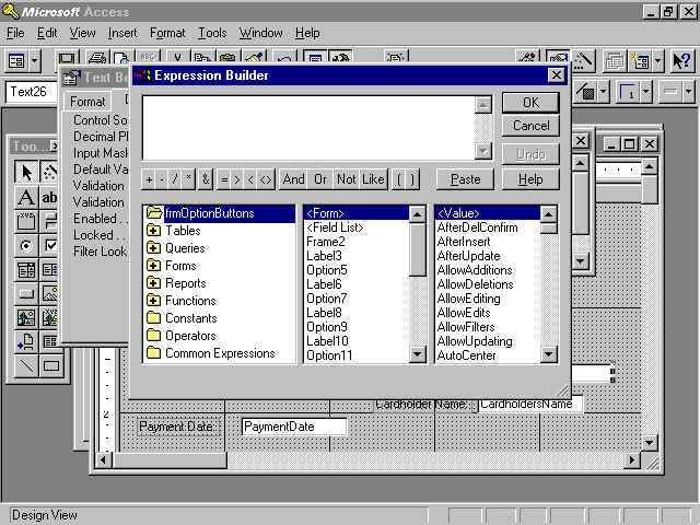
As mentioned in the previous section, a control can contain any valid expression. The expression is entered as a control's control source. When entering an expression as a control source, the expression must be preceded by an equal sign. The control source can be manually typed, or you can use the Expression Builder to ease the process of entering the expression.
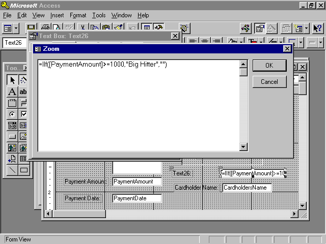
To add an expression to a control source, start by adding an unbound control to the form. To use the Expression Builder, click in the Control Source property of the control and then click the ellipsis. The Expression Builder appears (see Figure 6.29). The list box on the left allows you to select the type of object you want to include in the expression. The middle and right list boxes let you select the specific element that you want to paste into your expression. The Expression Builder is useful when you are not familiar with the specific syntax required for the desired expression. An expression can also be entered directly into the text box for the Control Source property. To view the expression more easily, you can use the Zoom feature (Shift+F2 keys). The Zoom dialog for the control source is shown in Figure 6.30. The expression that appears in the figure evaluates the PaymentAmount. If the PaymentAmount is greater than or equal to 1,000, the message Big Hitter is displayed; otherwise, nothing is displayed.
Figure 6.29. The Expression Builder helps you add an expression as a control's control source.
Figure 6.30. The Zoom dialog for a control source.
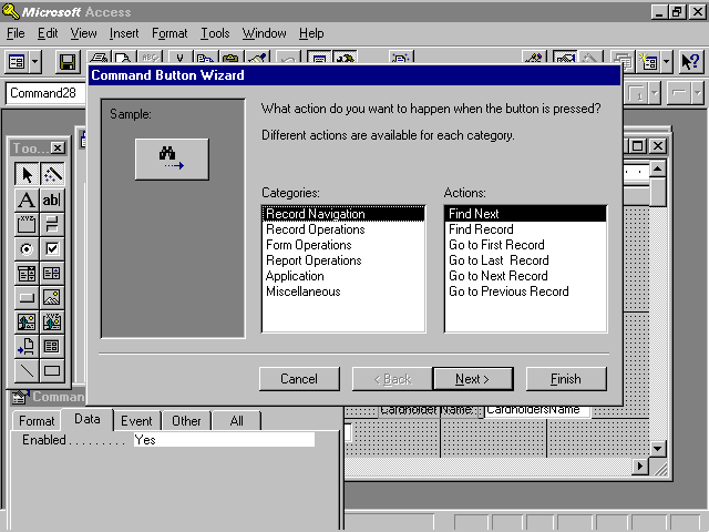
The Command Button Wizard enables you to quickly and easily add functionality to your forms. It writes the code to perform 32 commonly required tasks. The tasks are separated into record navigation, record operations, form operations, report operations, application operations, and other miscellaneous tasks. The first step of the Command Button Wizard is shown in Figure 6.31. This step allows you to specify the category of activity and specific action you want the command button to perform. The subsequent wizard steps vary depending on the category and action you select.
Figure 6.31. The first step of the Command Button Wizard.
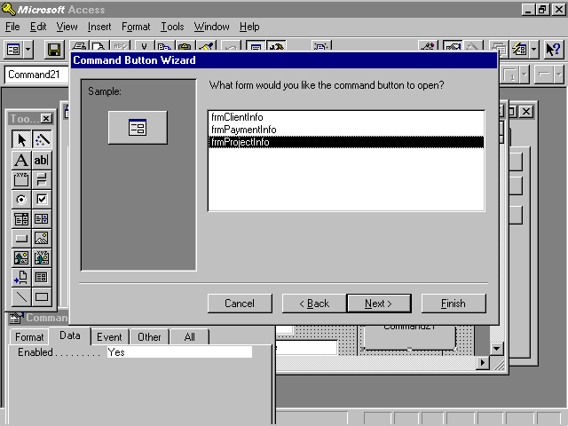
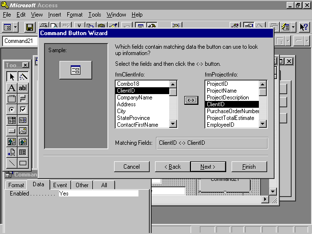
Figure 6.32 shows the second step of the Command Button Wizard when the Form Operations category and Open Form action are selected in the first step of the wizard. Notice that this step of the wizard asks which form you want to open. After selecting a form and clicking Next, you are asked whether you want Access to open the form and find specific data to display, or whether you want the form to be opened and all records to be displayed. If you indicate that you want only specific records to be displayed, the dialog shown in Figure 6.33 appears. This dialog asks you to select fields relating the two forms. The next step of the wizard asks you to select text or a picture for the button. The final step of the wizard asks you to name the button.
Figure 6.32. The Command Button Wizard requesting the name of a form to open.
Figure 6.33. The Command Button Wizard asking for the fields that relate each form.
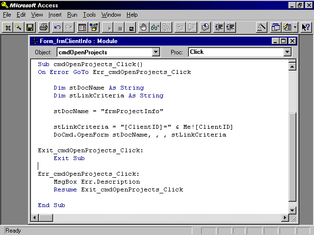
The amazing thing about the Command Button Wizard is that it varies immensely depending on the features you select. It allows you to add somewhat sophisticated functionality to your application without writing a single line of code. The code generated by the example just outlined is shown in Figure 6.34. This code makes a lot more sense after you read the next couple of chapters. The great thing is that it is fully modifiable after it is written. This means that you can have Access do some of the dirty work for you, and then you can customize the work to your liking.
Figure 6.34. Code generated from the Command Button Wizard.
Many forms are based on more than one table. An example is a form that shows a customer at the top and the orders associated with that customer at the bottom. This is considered a One-to-Many form. Forms can also be based on a query that joins more than one table. Rather than seeing a One-to-Many relationship in such a form, you see the two tables displayed as one, with each record on the many side of the relationship appearing with its parent's data.
There are several ways to create One-to-Many forms. As with many other types of forms, you can use a wizard to assist you, or you can build the form from scratch. Because all the methods for creating a form are useful to users and developers alike, the available options are covered in this section.
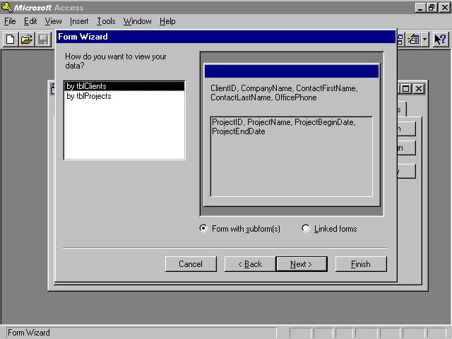
Building a One-to-Many form using the Form Wizard is a simple process involving 11 steps:
Figure 6.35. The Form Wizard creating a One-to-Many form.
The resulting form is a main form that contains a subform. An example is shown in Figure 6.36.
Figure 6.36. The result of creating a One-to-Many form with the Form Wizard.
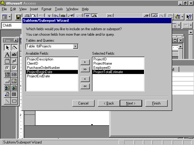
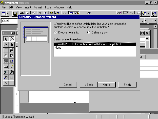
A One-to-Many form can also be created by building the parent form and then adding a Subform/Subreport control. The Subform/Subreport control is found in the toolbox. If you want to utilize the Subform/Subreport Wizard, make sure the Control Wizards tool is selected before you add the Subform/Subreport control to the main form, and then follow these steps:
Figure 6.37. Selecting fields to include in the subform.
Figure 6.38. Defining the relationship between the main form and the subform.
The resulting form should look similar to the form created with the Form Wizard. Creating a One-to-Many form this way is simply an alternative to creating the form using the Form Wizard.
Another way to add a subform to a main form is to click and drag a form from the database window onto the main form. Access attempts to identify the relationship between the two forms.
After a subform has been added, you need to understand how to work with it. To begin, familiarize yourself with a few properties of a Subform control:
Source Object: The name of the form that is being displayed within the control.
Link Child Fields: The fields from the child form that link the child form to the master form.
Link Master Fields: The fieldss from the master form that link the child form to the master form.
You also need to understand how to make changes to the subform. One option is to open the subform as you would open any other form. After closing and saving the form, all the changes automatically appear in the parent form. The other choice is to modify the subform from within the main form. With the main form open, start by making sure the subform is not selected. Then double-click on the subform. The subform should open.
The default view of the subform is Datasheet or Continuous Forms, depending on how you added the subform and what options you selected. If you want to modify the default view, simply change the Default View property of the subform.
If the subform is displayed in Datasheet view, the order of the columns in the datasheet is dependent on the tab order of the fields within the subform. When the subform is displayed in Datasheet view, the order of the fields in the subform has no bearing on the datasheet that appears within the main form. You must modify the tab order of the fields in the subform to change the order of the fields in the resulting datasheet.
Chapter 2 talked about strategies for developing Access applications. One of the strategies discussed was basing forms on queries. By basing a form on a query, you achieve optimal performance and flexibility. Rather than bringing all fields and all records over the network, you bring only the fields and records that you need. The benefits are even more pronounced in a client/server environment where the query is run on the server. Even in an environment where data is stored in the proprietary Access file format (.MDB) on a file server, a form based on a stored query is better able to take advantage of Access's indexing and paging features. Furthermore, by basing a form on a query, you can better control which records are included in the form and in what order they appear. Finally, you can base a form on a query containing a One-to-Many join, thereby viewing parent and child information as if it were one record. Notice in Figure 6.39 that the client and project information appears on one form as if they were one record.
Figure 6.39. A form based on a One-to-Many query.
Most developers are unaware that a stored query generally provides better performance than an embedded SQL statement. When a query is saved, Access compiles the query and creates a Query Plan. This Query Plan contains information regarding the best way to execute the query based on available indexes and the volume of data. If a form is based on an embedded SQL statement, the SQL statement is compiled and optimized each time the form is opened. The difference in performance is particularly apparent with forms that are opened frequently.
Basing a form on a stored query can actually degrade performance if the volume of data in the tables underlying the form varies dramatically, because the stored query plan is inaccurate. If the amount of data in the tables underlying a form is not relatively stable, it is advantageous to base the form on an embedded SQL statement rather than on a stored query. In this case, the process of recompiling the query and re-creating the query plan each time the form is opened actually serves to improve performance.
Several forms are required by the time and billing application. The more important ones are designed in this section. They are included in the CHAP6.MDB file on your sample code CD.
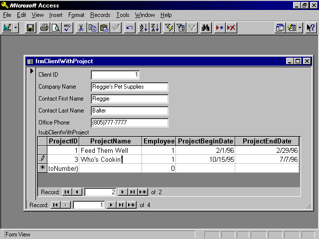
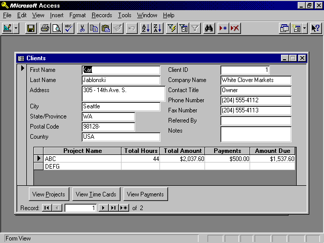
Figure 6.40 shows the frmClients form. This form is a One-to-Many form containing a subform called fsubClients. The main form is based on a query called qryClients, and the subform is based on a query called qryClientsSub.
Figure 6.40. The frmClients form shows all of the projects associated with the selected client.
The form footer contains three command buttons. The Projects command button opens the frmProjects form with a Where condition, showing only the projects associated with the client being displayed on the main form. The frmPayments form is opened for the project selected in the fsubClients subform. Rather than using a Where condition on the OpenForm statement, the criteria is set in the query underlying the frmPayments form. The frmTimeCards form is opened without regard for the selected client. It allows time cards to be entered for any project, regardless of the client.
The three command buttons can be added using the Command Button Wizard. Select the category Form Operations and the action Open Form. Make sure you open the frmPayments form with a Where condition. Do this by selecting "Open the form and find specific data to display" on the third step of the Command Button Wizard. Name the buttons cmdProjects, cmdPayments, and cmdTimeCards. One important line needs to be added to each piece of code that the Command Button Wizard writes. To add this line of code, while in Design view of the frmClients form, click the command button whose code you want to modify. View the command button's Event properties. Click the ellipsis to the right of the Click event for the command button. Add the following line of code before the DoCmd.OpenForm line:
DoCmd.DoMenuItem acFormBar, acRecordsMenu, acSaveRecord, acMenuVer70
This line of code saves the current client record before opening any of the other forms. An example of the completed routine looks like this:
Sub cmdProjects_Click()

On Error GoTo Err_cmdProjects_Click

    Dim stDocName As String

    Dim stLinkCriteria As String

    DoCmd.DoMenuItem acFormBar, acRecordsMenu, acSaveRecord, , acMenuVer70

    stDocName = "frmProjects"

    stLinkCriteria = "[ClientID]=" & Me![ClientID]

    DoCmd.OpenForm stDocName, , , stLinkCriteria

Exit_cmdProjects_Click:

    Exit Sub

Err_cmdProjects_Click:

    MsgBox Err.Description

    Resume Exit_cmdProjects_Click

End Sub
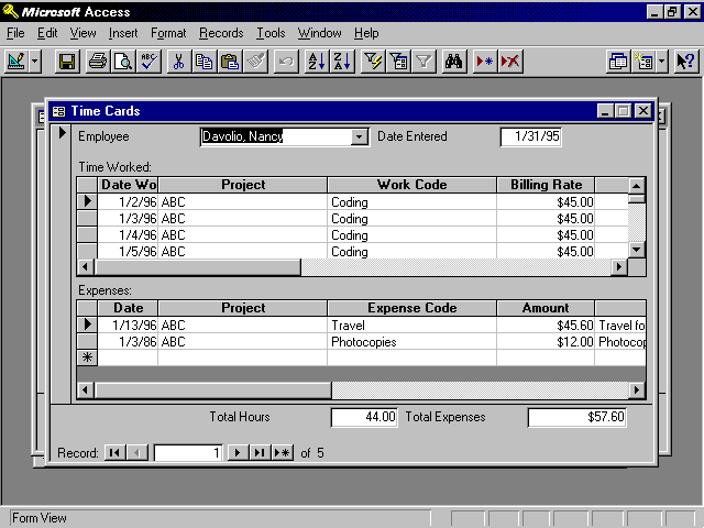
The frmTimeCards form is based on a query called qryTimeCards. It contains two subforms (see Figure 6.41). The first subform is fsubTimeCards and the second is fsubTimeCardsExpenses. The fsubTimeCards subform is based on a query called qrySubTimeCards. It contains a Calculated control in its footer. The control is called TotalHoursWorked and contains the expression =Sum(BillableHours). This expression totals the billable hours within the subform. The fsubTimeCardsExpenses subform is based on a query called qrySubTimeCardsExpenses. It contains a Calculated control in its footer. The control is called TotalExpenses and contains the expression =Sum(ExpenseAmount), which totals the expense amounts within the subform.
Figure 6.41. The frmTimeCards form shows all of the time and expenses entered for a particular employee.
The footer of the frmTimeCards form contains two controls: one called TotalBillableHours and the other called TotalExpenses. The TotalBillableHours control contains the following expression:
=[fsubTimeCards].[Form]!TotalHoursWorked]
This expression pulls the result of the calculation of the TotalHoursWorked control on the fsubTimeCards Subform. The TotalExpense control contains the following expression:
=[fsubTimeCardsExpenses].[Form]!TotalExpenses]
This expression pulls the result of the calculation of the TotalExpenses control on the fsubTimeCardsExpenses form.
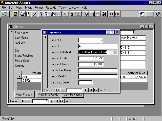
The frmPayments form is based on a query called qryPayments. The qryPayments query contains criteria for the ProjectID. The criteria looks like this:
[Forms]![frmClients]![fsubClients].[Form]![ProjectID]
This criteria looks at the ProjectID control from the subform fsubClients that is part of the frmClients form. This criteria ensures that you are looking only at payments relating to the selected project. The Payments form appears in Figure 6.42. The Project Name text box contains the following expression:
=[Forms]![frmClients]![fsubClients].[Form]![ProjectName]
Figure 6.42. The frmPayments form is used to enter payments associated with a project.
This expression displays the ProjectName from the subform called fsubClients on the frmClients form.
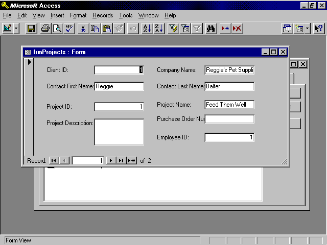
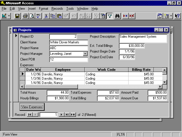
The frmProjects form is more complex than the others. It contains two subforms, one on top of the other. The View Expenses button is a toggle that allows the user to view both expenses and hours (see Figure 6.43).
Figure 6.43. The frmProjects form allows the user to view the expenses and hours associated with the selected project.
The frmProjects form is based on a query called qryProjects. This query has the following expression as the criteria for the ProjectID:
[Forms]![frmClients]![ClientID]
This means that only projects with the ClientID displayed in the frmClients form are shown. The two subforms are fsubProjects and fsubProjectExpenses. The code that toggles their visibility is covered in Chapter 10, "The Real Scoop on Objects, Properties, and Events." The fsubProjects form is based on qrySubProjects. The fsubProjectExpenses form is based on qrySubProjectExpenses. The frmProjects form, as well as the subforms, contains several calculated controls.
The application that you are building is modeled after the time and billing application created by the Database Wizard. You build the application from scratch so that you can learn about all its components. You will also add significant functionality to the application. When you are done, your application will be far more powerful than the application built by the Database Wizard.
Microsoft Access provides you with extremely rich and powerful tools that you can use to build even the most sophisticated of forms. This chapter began by providing you with an overview of what Access forms are capable of. It then showed you the many ways in which you can create a new form.
Regardless of how a form has been created, it is important that you understand how to modify all of the attributes of a form and its controls. This chapter showed you how to work with form objects, modifying both their appearance and how they are tied to data. Each control type and its properties were discussed in detail. All of the properties of the form itself were also discussed. Using the techniques covered in this chapter, you can control the appearance and functionality of a form and its objects.